Running an LLM evaluation usually dumps a wall of numbers onto your screen. You get accuracy scores, latency measurements, toxicity flags, and reasoning benchmarks. But staring at a spreadsheet of 50 metrics across five different models doesn't tell you what’s actually happening. It hides the patterns. It buries the weaknesses.
This is where visualization techniques for large language model evaluation results step in. They transform raw data into something your brain can process instantly. Instead of guessing which model is faster or more accurate, you see it. This field has exploded since 2023 as models grew too complex for simple scorecards. Now, researchers and engineers use specialized charts to diagnose bias, track training progress, and compare trade-offs between speed and quality.
Why Standard Charts Fail LLM Evaluations
You might think a basic bar chart is enough. After all, it works for sales reports. But LLM evaluation is multidimensional. A model might ace factual recall but fail miserably on safety checks. Another might be blazing fast but hallucinate constantly. A single number collapses this complexity into a misleading average.
Dr. John Stasko from Georgia Tech points out that many current visualizations prioritize looking good over being useful. He notes that aesthetic appeal often masks analytical gaps, leading teams to make decisions based on pretty pictures rather than rigorous data. The real challenge isn’t just showing the score; it’s showing the uncertainty, the context, and the relationships between different capabilities.
Consider this: if Model A has a 90% accuracy with a wide confidence interval, and Model B has an 88% accuracy with a tight one, which is safer? A standard bar chart might show them as nearly identical. A proper visualization highlights the risk in Model A immediately. That distinction saves you from deploying a brittle system.
The Core Visualization Toolkit
Not every chart serves every purpose. Based on a 2024 analysis by Khan et al. covering 157 papers, here are the heavy hitters and when to use them:
- Bar Charts: The most common tool (63% usage). Best for comparing single metrics like MMLU or GLUE scores across multiple models. They are fast to read but terrible at showing uncertainty or multi-dimensional trade-offs.
- Scatter Plots: Used in 28% of evaluations. Ideal for revealing correlations, such as plotting accuracy against inference time. For example, you can plot GPT-4o (89.7% accuracy, 120ms) against Claude 3 (82.3% accuracy, 150ms) to see who offers the best speed-to-quality ratio.
- Line Charts: Tracked in 19% of studies. Essential for showing evolution over time or scale. Use these to visualize how Llama 3’s MMLU score jumped from 38.2 to 52.8 as parameters increased from 7B to 70B.
- Token Heatmaps: Deep-dive diagnostic tools. They use color gradients (red for high importance >0.8, blue for low <0.2) to show which words drove a model’s decision. These are crucial for debugging why a model gave a specific answer, though they require expertise to interpret correctly.
| Technique | Best Use Case | Key Limitation | User Effectiveness |
|---|---|---|---|
| Bar Chart | Comparing top-performing models on single metrics | Fails to represent uncertainty intervals | 32.7% faster than tables for identification |
| Scatter Plot | Correlations (e.g., Speed vs. Accuracy) | Struggles with more than two dimensions | 89.4% accuracy in relationship identification |
| Heatmap | Token-level importance and attention weights | High misinterpretation rate for novices (41.3%) | 92.1% effectiveness for experts |
| Parallel Coordinates | Multi-dimensional profiling (12+ metrics) | Visual clutter with >300 data points | High interactivity, steep learning curve |
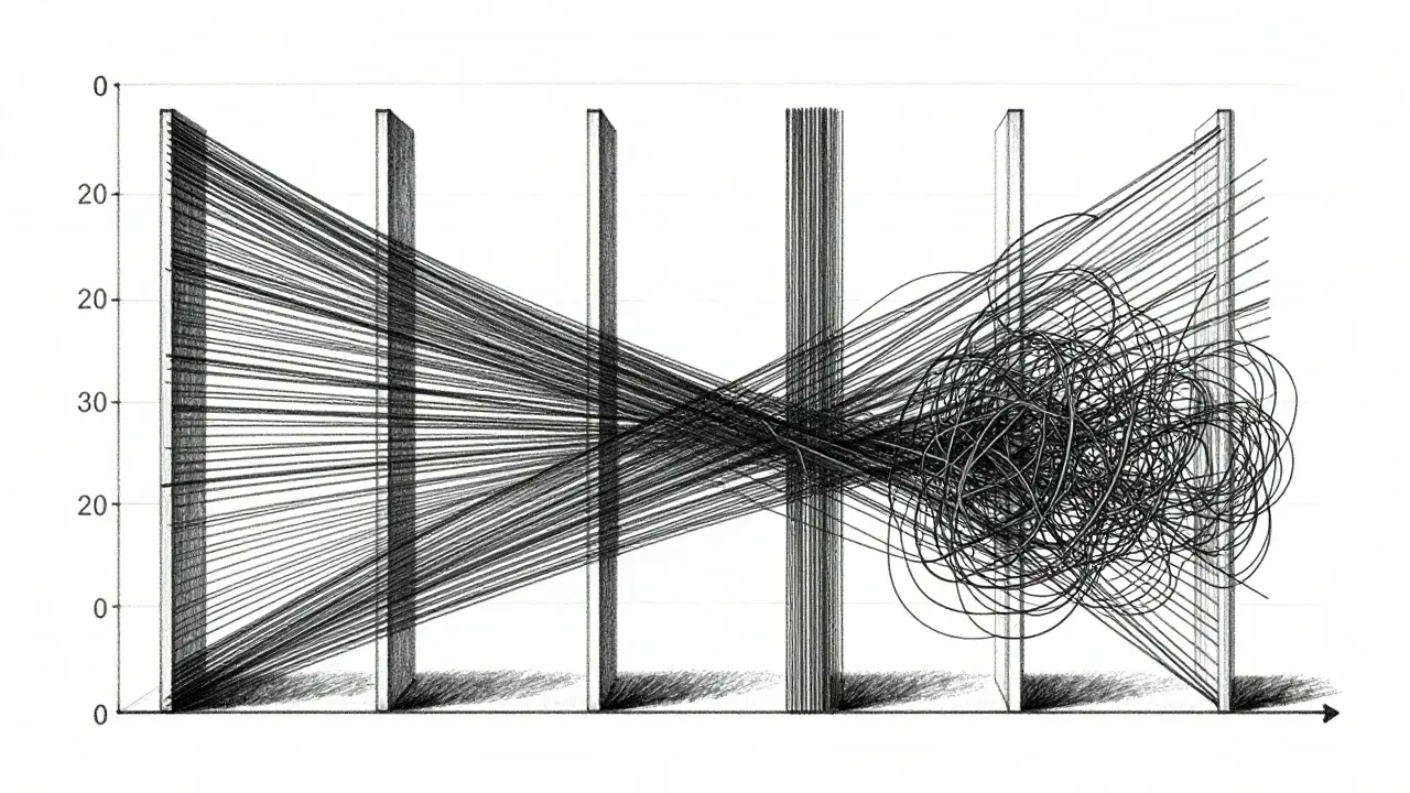
Handling High Dimensions with Parallel Coordinates
When you need to look at more than two metrics at once-say, accuracy, toxicity, latency, cost, and fairness-standard charts break down. This is where parallel coordinates shine. The EvaLLM framework, introduced in a 2024 IEEE VIS paper, uses interactive parallel coordinates to let users brush and filter across 12 metrics simultaneously.
Imagine vertical axes for each metric. Each model becomes a polyline connecting its values across those axes. You can visually spot clusters of high-performing, low-cost models. However, there’s a catch. EvaLLM supports up to 500 evaluation points before performance degrades. If you push past 300 points, the lines tangle into a mess. Users report that the visualization becomes unusable due to clutter unless you apply aggressive filtering.
To make this work, you need WebGL-enabled browsers and solid hardware. On standard setups, interactions take about 1.2 seconds per click. It’s powerful, but it demands patience and clean data. Don’t try to plot raw, noisy logs without pre-aggregation.
The Uncertainty Gap
Here’s a critical flaw in most LLM evaluations: they ignore uncertainty. Models are probabilistic. A single run doesn’t define their capability. Yet, 78% of modern evaluations include uncertainty intervals, and 78% of visualization techniques fail to display them adequately.
If you hide the error bars, you create overconfidence. You might pick a model that looks slightly better on average but is wildly inconsistent. Dr. Vinit Chandak from IIT Delhi found that precise value retrieval remains the hardest task for both humans and AI interpreters. Even GPT-4 only achieves 62.3% accuracy when trying to read exact values from complex charts, compared to 89.7% for recognizing trends.
Your job is to design visuals that highlight stability. Use violin plots or box-and-whisker charts instead of simple bars when variance matters. Show the spread. If a model’s score jumps around by 10%, that volatility needs to be visible, not buried in the mean.
Tools of the Trade: LIDA, NL4DV, and Beyond
You don’t have to build these from scratch using Matplotlib. Several specialized tools exist, each with trade-offs.
LIDA (Language-Integrated Data Analysis) automates the creation of visual narratives. Its "Infographer" module generates charts and explanations automatically. Users love the output-it’s beautiful and coherent. But beware: automation can mislead. In user tests, LIDA produced visually appealing but sometimes inaccurate representations of complex relationships. It’s great for quick drafts, not final audits.
NL4DV takes a different approach. It converts natural language queries into Vega-Lite specifications. It’s highly accurate for standard charts but produces visually basic outputs. Developers prefer it for precision over polish.
For enterprise teams, platforms like Weights & Biases and Arize are integrating these capabilities directly into their MLOps pipelines. By 2024, 68.3% of enterprise MLOps tools added specialized LLM evaluation visualization features. This convergence means you’ll soon expect these charts to appear automatically alongside your training logs.
Practical Implementation Checklist
Getting started requires more than just installing Python libraries. Here’s what you need to know:
- Define Your Metrics First: Don’t visualize everything. Pick the 5-7 metrics that drive business decisions. Mapping complex metrics to visual channels is rated 7.8/10 in difficulty. Simplify early.
- Standardize Colors: Inconsistent color schemes confuse readers. Adopt a palette where red always means "high risk" or "low performance." Research groups that standardized palettes saw fewer misinterpretations.
- Use Dimensionality Reduction: If you have 20 metrics, use PCA or t-SNE to reduce them before plotting. 42.7% of successful implementations use this technique to avoid clutter.
- Invest in Interactivity: Static images fail for deep dives. Interactive filtering allows users to isolate specific failure modes. Teams implementing interactive filters reported higher satisfaction, despite the 3.2x increase in development effort.
- Check for Bias Propagation: Use causal graphs (like those in Causal Auditor) to map how input biases flow to outputs. Directional arrows indicate causal strength. This is vital for fairness audits.
Future Trends: Multimodal and Adaptive Visuals
The field is moving fast. Dr. Miriah Meyer predicts that by 2027, 92% of LLM evaluations will use interactive, multi-dimensional visualization as standard practice. We’re already seeing the shift toward multimodal evaluation. Modern LLMs handle text, image, and audio. Your visualizations must reflect that cross-modal nature.
Look out for adaptive visualization systems expected in mid-2025. These prototypes will automatically select the best chart type based on your data characteristics. No more manually choosing between scatter and bar charts. The system will analyze the distribution and suggest the optimal view.
Also, keep an eye on the VisEval benchmark released in late 2024. It’s designed specifically to test how well visualization techniques perform. Early results show GPT-4o handles common tasks well but struggles with complex radar charts. As these benchmarks mature, we’ll get clearer standards for what constitutes a "good" evaluation viz.
What is the best chart for comparing LLM accuracy and speed?
A scatter plot is the most effective choice. It allows you to plot accuracy on the Y-axis and inference time (latency) on the X-axis. This reveals the trade-off clearly, helping you identify models that offer the best balance of performance and efficiency.
Why do heatmaps often confuse novice users?
Heatmaps encode data through color intensity, which requires understanding the underlying scale and legend. Studies show that 41.3% of novice users misinterpret heatmap visualizations because they struggle to map colors back to specific numerical values or importance weights without clear contextual cues.
How does EvaLLM handle large datasets?
EvaLLM uses WebGL for rendering, allowing it to handle up to 500 evaluation points. However, performance degrades significantly beyond 300 points due to visual clutter in parallel coordinates. For larger datasets, you should use aggregation or filtering before visualization.
Is LIDA better than NL4DV for LLM evaluation?
It depends on your priority. LIDA produces more aesthetically pleasing and narratively rich outputs, making it great for presentations. However, NL4DV is more accurate for technical precision, generating correct Vega-Lite specs for complex queries. Use LIDA for communication and NL4DV for rigorous analysis.
What is the "uncertainty gap" in LLM visualization?
The uncertainty gap refers to the failure of 78% of visualization techniques to adequately represent confidence intervals or variance in model scores. This leads to overconfident decisions, as users see a single average score without understanding the model's consistency or reliability across different runs.