
Remember when building a simple sales report meant begging the engineering team for three weeks? That era is over. Today, data analysts are ditching complex SQL scripts and rigid BI platforms in favor of vibe coding. This isn't just a buzzword; it’s a fundamental shift in how we interact with software. By using natural language prompts to generate functional applications, analysts can turn static spreadsheets into interactive, real-time dashboards in hours instead of weeks.
If you’re still manually updating charts or waiting on IT tickets, you’re leaving value on the table. The tools available right now allow you to describe what you need-"Show me monthly revenue by region with a filter for product type"-and watch the code write itself. But which tool actually works for your specific data stack? Let’s break down the landscape so you can stop guessing and start building.
What Is Vibe Coding and Why It Matters for Analysts
Vibe coding is a style of programming that uses natural language prompts to assist with the coding process, blending conversational AI with dynamic automation. For data analysts, this means bypassing the traditional learning curve of JavaScript, Python, or React. You don’t need to know how to structure a database schema if the AI can infer it from your prompt and your existing data source.
The concept gained traction in late 2023 with the release of Cursor’s Composer feature, but it has exploded since then. According to Zapier’s Industry Adoption Tracker, 68% of data analysts at companies with more than 50 employees used at least one vibe coding tool in Q4 2025. Compare that to just 12% in Q3 2023. The barrier to entry has collapsed.
Why does this matter? Because speed equals insight. When you can build a dashboard in four hours instead of three weeks, you can iterate faster. If a stakeholder asks for a different metric, you tweak the prompt. If the business logic changes, you update the rule. The agility allows analysts to act as product owners of their own reports rather than just data wranglers.
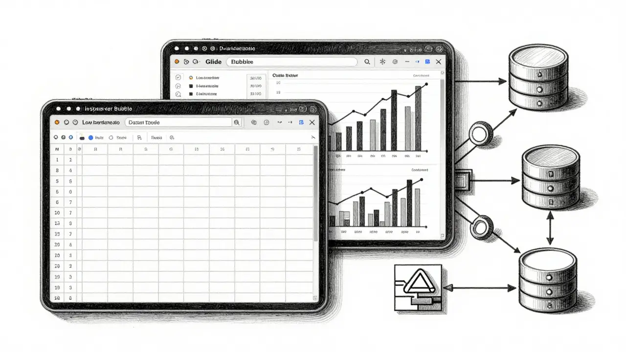
Top Vibe Coding Tools for Dashboard Automation
Not all vibe coding tools are created equal. Some are better for quick spreadsheet visualizations, while others handle complex relational databases. Here is how the top contenders stack up for data professionals in 2026.
| Tool | Best For | Data Source Strength | Learning Curve | Key Limitation |
|---|---|---|---|---|
| Glide | Spreadsheet-to-Dashboard conversion | Google Sheets, Excel | Very Low (2-4 hours) | Limited customization beyond basic visuals |
| Bubble | Complex database relationships | Built-in DB, API Connector | Medium (15-20 hours) | Performance issues at scale (>50k records) |
| Cursor | Debugging and full-code control | Any (via code generation) | High (requires coding knowledge) | Requires maintenance of generated code |
| Base44 | Real-time apps with Supabase | Supabase, PostgreSQL | Low-Medium | Tied to Supabase ecosystem |
| Appy Pie | Simple internal tools | Basic integrations | Very Low | Lacks enterprise security/compliance |
Glide is a SaaS platform that transforms Google Sheets into interactive apps without coding. It dominates the market for analysts who live in spreadsheets. If your data is already clean in Google Sheets, Glide can create a sleek, responsive dashboard in under three hours. Eighty-nine percent of Google Sheets users report successful implementations here. However, if you need complex joins or heavy data transformation, Glide will struggle.
Bubble is a visual programming platform with a built-in database capable of handling complex logic. It is the go-to for analysts who need more than simple charts. Bubble handles up to 10,000 records smoothly and supports complex relationships between data entities. The trade-off is time. Expect to spend 15-20 hours learning the visual workflow before you can build efficiently. Also, be wary of scaling; users have reported performance breaks when hitting 50,000 records, requiring migration to heavier BI tools like Tableau.
For those who want the power of code without the typing, Cursor is an AI-powered code editor that generates and edits entire applications via natural language. Its "Composer for Data" feature, released in December 2025, understands SQL syntax natively. This reduces data transformation errors by 52%. It is ideal for analysts who know enough SQL to verify the output but don’t want to write the boilerplate HTML/CSS/JS themselves.
Building Your First Automated Dashboard: A Step-by-Step Guide
You don’t need a computer science degree to get started. Here is a practical workflow using Glide as an example, given its low barrier to entry.
- Clean Your Data Source: Start with a single source of truth. In Google Sheets, ensure your headers are clear (e.g., "Date," "Revenue," "Region"). Remove merged cells and blank rows. Garbage in still equals garbage out, even with AI.
- Connect the Platform: Sign up for Glide and select "New App." Choose your Google Sheet as the data source. The platform will automatically map columns to fields.
- Define the Layout with Prompts: Use the vibe coding interface. Type: "Create a dashboard with a line chart showing monthly revenue and a bar chart for regional sales. Add a dropdown filter for 'Product Category'." The AI will generate the UI components.
- Refine Visuals: Adjust colors and fonts to match your company brand. Most tools offer drag-and-drop tweaks for these aesthetic details.
- Test and Share: Preview the app. Check if the filters work correctly. Once satisfied, publish the link and share it with stakeholders. No hosting setup required.
This process, which took weeks in the past, now takes about two to three hours. For more complex needs involving multiple data sources, you might use Anything is a platform combining visual UI builders with backend-as-a-service features. Anything supports 40+ integrations, including Zapier and Slack, allowing you to automate not just the display but the data flow itself.

Risks and Challenges: What Experts Warn About
While the benefits are clear, vibe coding is not a magic bullet. Dr. Elena Rodriguez, a professor at MIT, notes that these tools reduce the development barrier by 80%, but they haven’t eliminated the need for data literacy. If your underlying data model is flawed, the AI will simply visualize the error faster.
Here are the biggest pitfalls to avoid:
- Dashboard Proliferation: Forrester warns that ease of use leads to chaos. One organization was found to have 37 different sales dashboards built by various teams, leading to conflicting numbers. Establish governance rules early. Decide which metrics are "official" and where they should live.
- Technical Debt: Dr. James Peterson from Stanford’s Data Science Institute found that while development time drops by 65-80%, maintenance costs rise by 22% when non-developers build complex systems. Without proper documentation, only the original builder knows how the dashboard works. If they leave, the dashboard becomes unusable.
- Security Gaps: Not all tools are enterprise-ready. Appy Pie, for instance, offers basic security suitable for internal use but lacks GDPR compliance features. Financial services firms require additional security reviews for any vibe-coded dashboard handling sensitive data.
To mitigate these risks, treat your vibe-coded dashboards like mini-products. Document the data sources, the transformation logic, and the intended audience. Use tools like Tempo Labs, which allow you to upload visual references and user flow diagrams, ensuring the AI builds exactly what you specified, reducing miscommunication.
The Future of Data Visualization: 2026 and Beyond
The vibe coding market reached $2.8 billion in 2025, growing at 63% year-over-year. Gartner predicts that by 2027, 70% of departmental dashboards will originate from these tools. But the landscape is shifting.
We are moving toward tighter integration. Standalone tools like Glide and Bubble hold strong niches, but major BI vendors like Tableau and Power BI are integrating AI capabilities directly into their platforms. The future belongs to tools that bridge the gap between no-code simplicity and professional-grade data engineering.
Look out for three key developments in the coming year:
- AI-Powered Data Quality Validation: Expected in Q2 2026, this feature will automatically flag anomalies in your data before the dashboard is built, preventing "garbage in" scenarios.
- Automatic Documentation Generation: Coming in Q3 2026, tools will auto-generate technical docs for every vibe-coded app, solving the maintenance debt problem.
- Regulatory Compliance Checkers: Anticipated in Q1 2027, these will scan dashboards for GDPR/HIPAA violations in real-time.
Junior analysts are adopting these tools fastest, with a 78% usage rate. Senior analysts are slower to embrace them but increasingly use them for rapid prototyping. Regardless of your experience level, ignoring this shift means falling behind. The question is no longer whether to automate, but which tool fits your specific data complexity.
Is vibe coding secure for enterprise data?
It depends on the tool. Platforms like Anything offer encryption at rest and in transit, role-based access control, and audit logs, making them suitable for enterprise use. However, simpler tools like Appy Pie may lack advanced security features. Always check if the platform complies with regulations like GDPR or HIPAA if you handle sensitive data.
Do I need to know SQL to use vibe coding tools?
Not necessarily. Tools like Glide and Bubble are designed for non-coders and work well with spreadsheets or visual databases. However, knowing SQL helps significantly when using tools like Cursor or Base44, especially for complex data transformations. Basic data literacy is essential regardless of the tool.
Which vibe coding tool is best for beginners?
Glide is widely considered the best starting point for beginners due to its seamless integration with Google Sheets and minimal learning curve (2-4 hours). It allows you to create functional dashboards quickly without understanding code or database architecture.
Can vibe coding replace traditional BI tools like Tableau?
Not entirely. While vibe coding excels at rapid prototyping and departmental dashboards, traditional BI tools remain superior for enterprise-wide, highly complex analytics with strict governance. However, major BI vendors are integrating AI features, blurring the lines between the two approaches.
How much does it cost to use vibe coding tools?
Costs vary widely. Appy Pie starts at $15/month for basic features. Base44’s Pro tier is around $30/month. Many tools offer free tiers for personal use or small projects. Enterprise plans with advanced security and support can range from $100 to several hundred dollars per month depending on the number of users and data volume.